Transforming a complex cashless gaming platform into an intuitive, visually polished mobile experience.
Everi partners with premier casino operators to power their digital guest experiences. In my early years with the company, a core responsibility was executing end-to-end mobile app redesigns for casino clients looking to modernize their mobile presence.
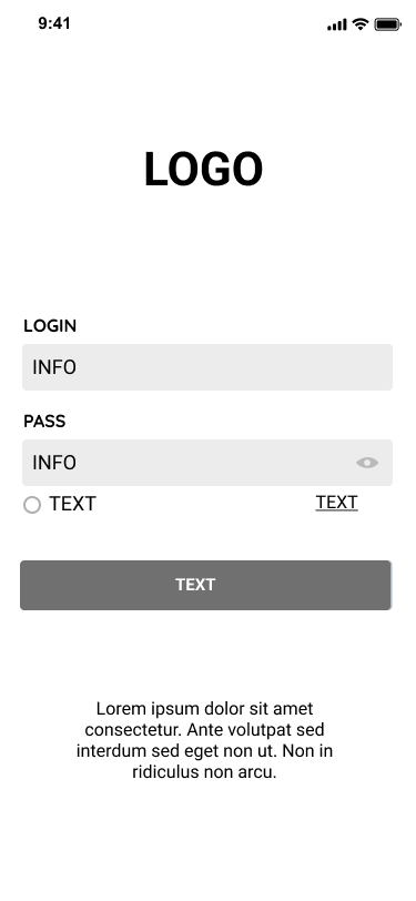
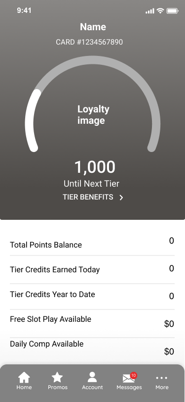
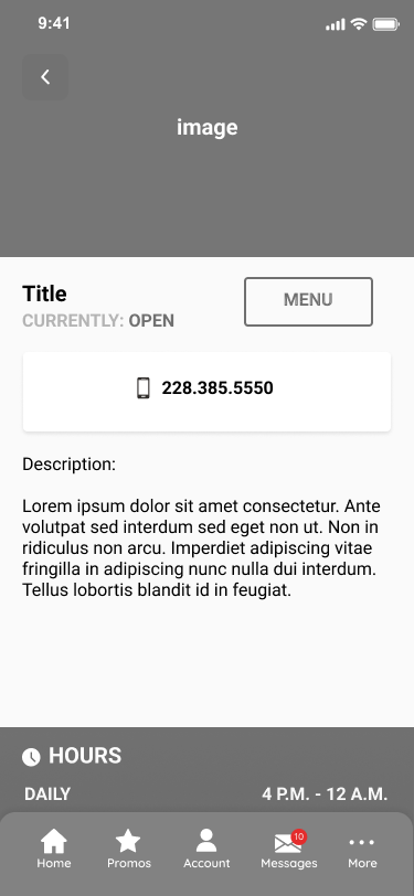
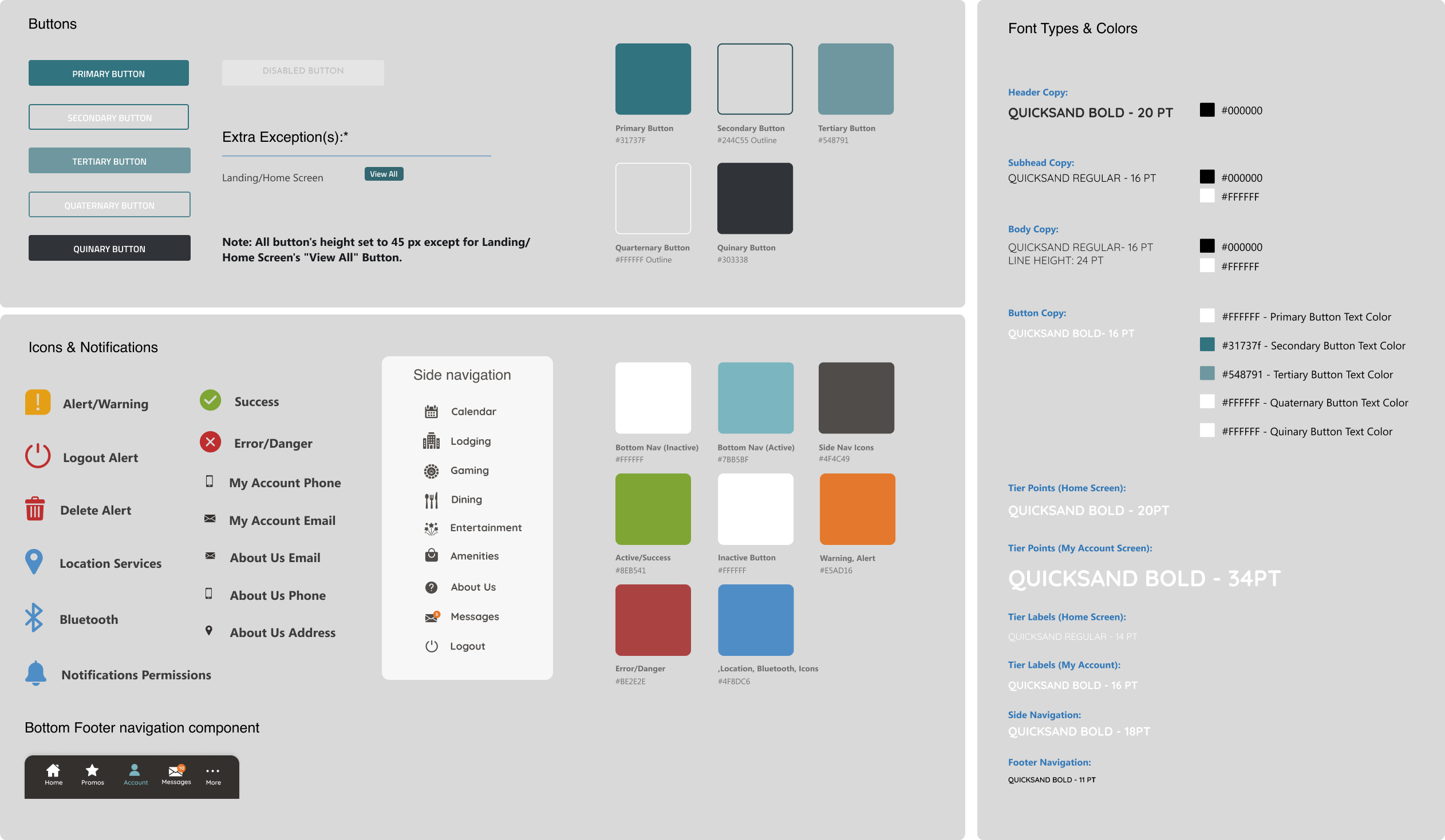
Rather than building each client application from scratch, our workflow utilized a core, centralized "generic" framework. I played a key role in refining this foundational UI blueprint, establishing a highly efficient system that allowed us to rapidly inject a client's unique visual identity—including color theory, typography, and graphic patterns.
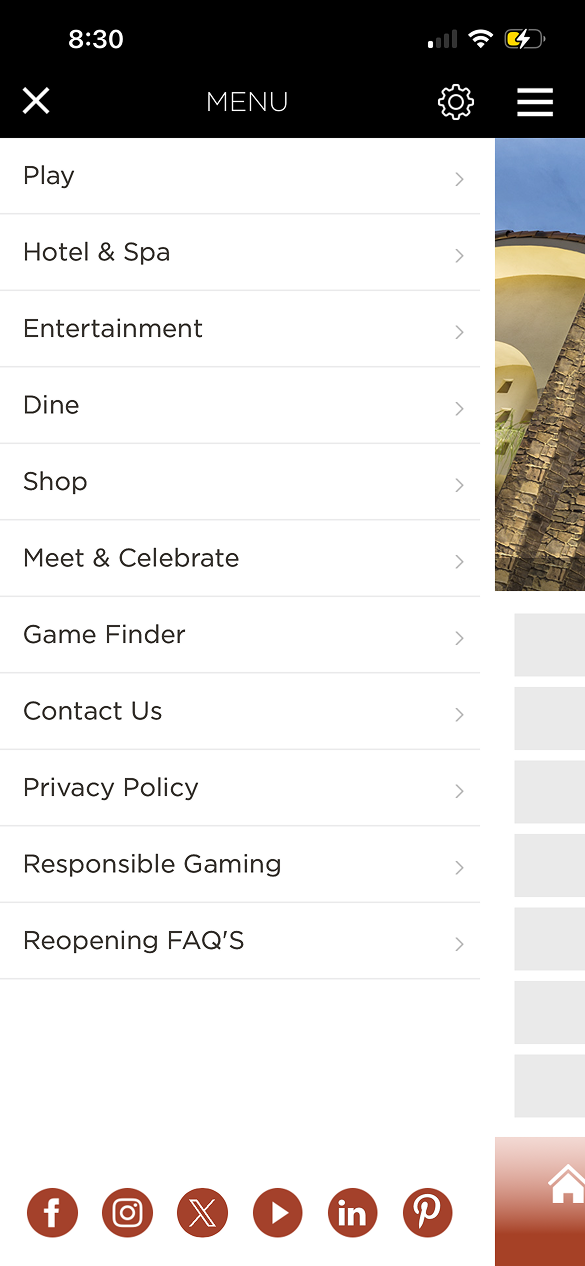
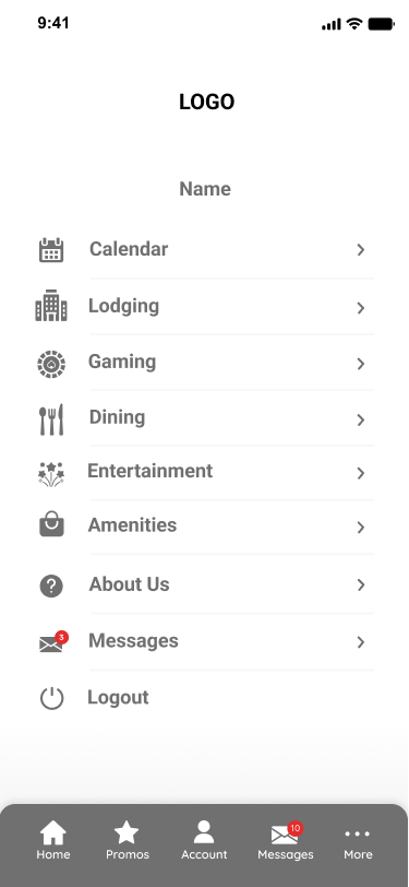
The original del Lago app was built on an outdated, text-heavy list system that created high cognitive load. Because it lacked a modern UI layout, essential guest services like hotel bookings and rewards club status were buried in a cluttered sidebar. The challenge was to transition the client away from their disorganized legacy design and onto our standardized, UX-optimized framework without losing their unique "premium resort" identity.
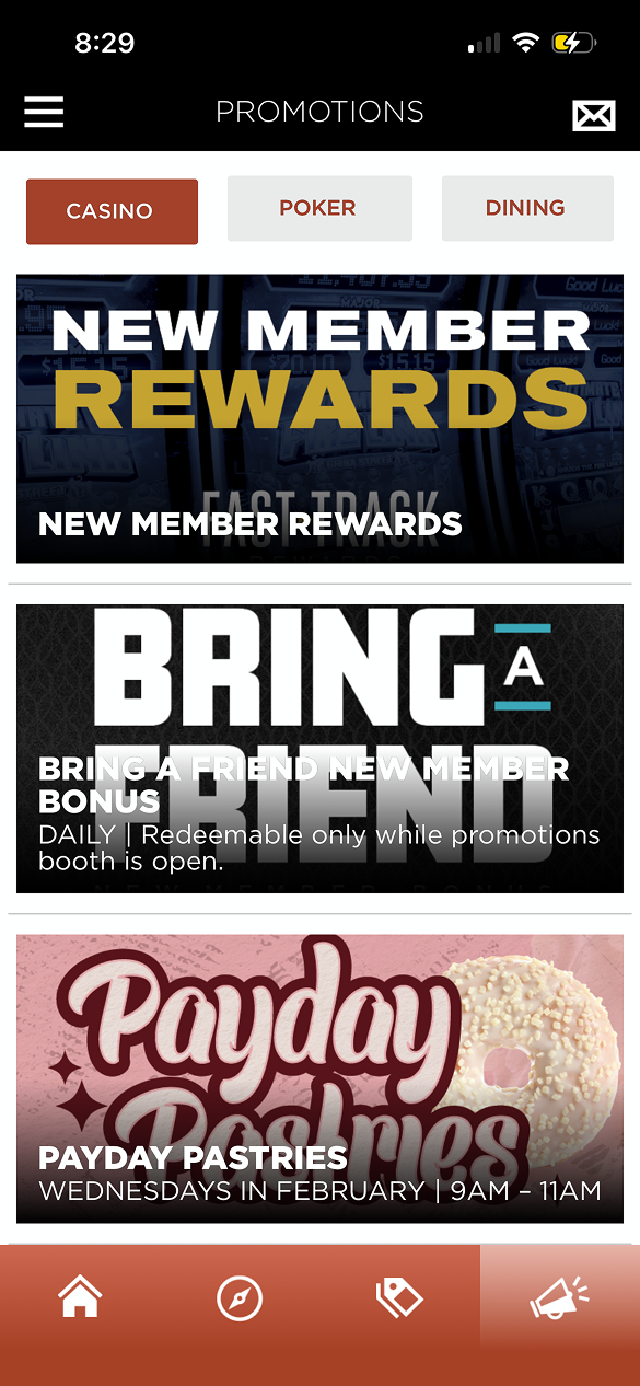
Legibility Hurdles: Promotional banners utilized "text-baked" graphics that were difficult to read and inconsistent in quality (e.g., the "Payday Pastries" vs. "Bring a Friend" screens).
Navigation Fatigue: Essential guest services were buried in a long, text-only sidebar menu, requiring multiple taps to access basic features like hotel booking or gaming rewards.
Lack of Hierarchy: There was no clear visual distinction between high-priority actions (Rewards) and secondary information (Privacy Policy), leading to a cluttered user journey.
Original Del Lago Design
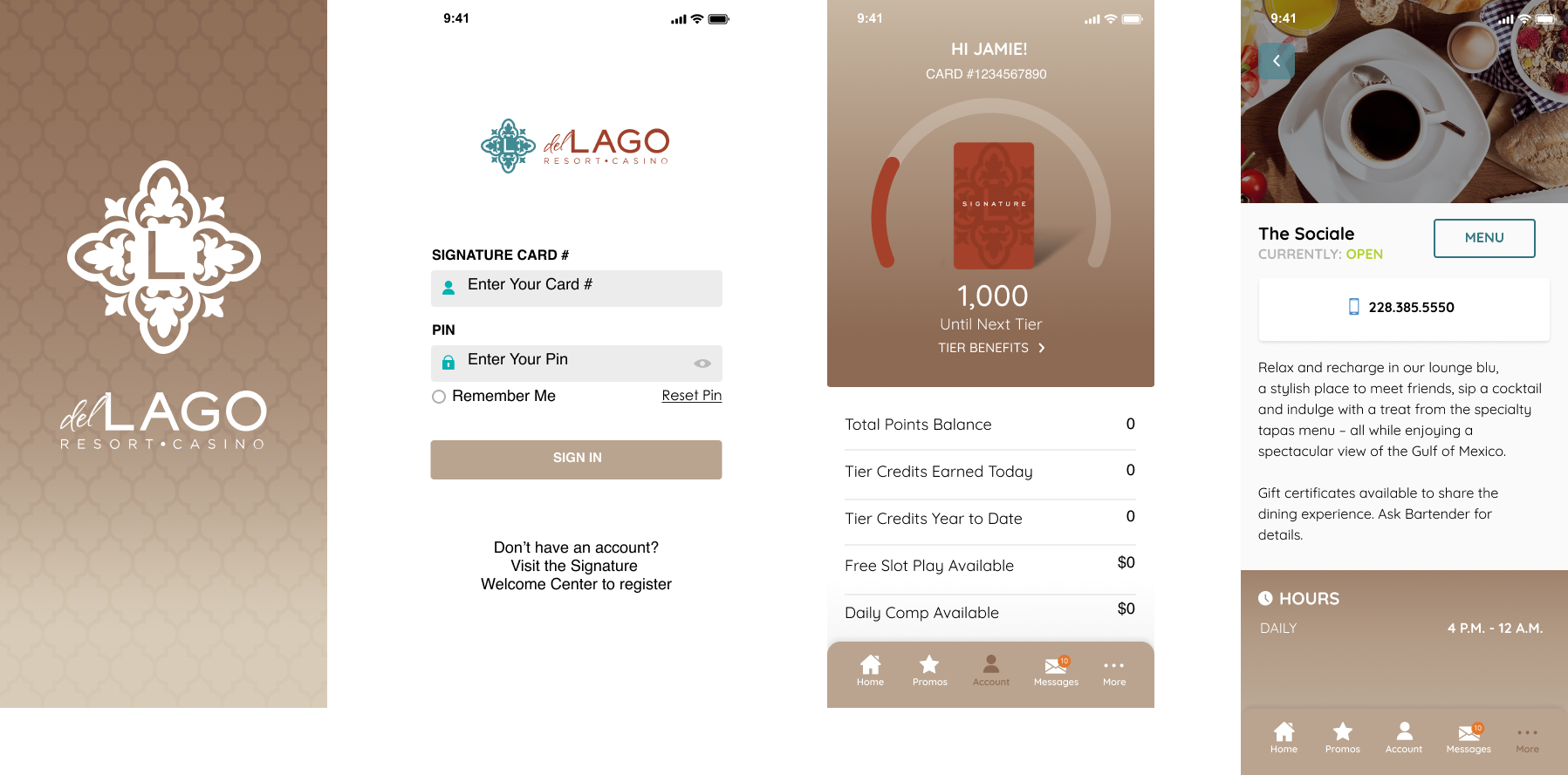
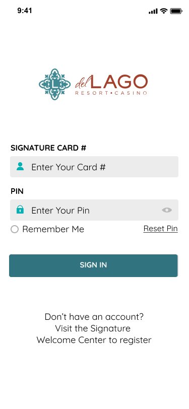
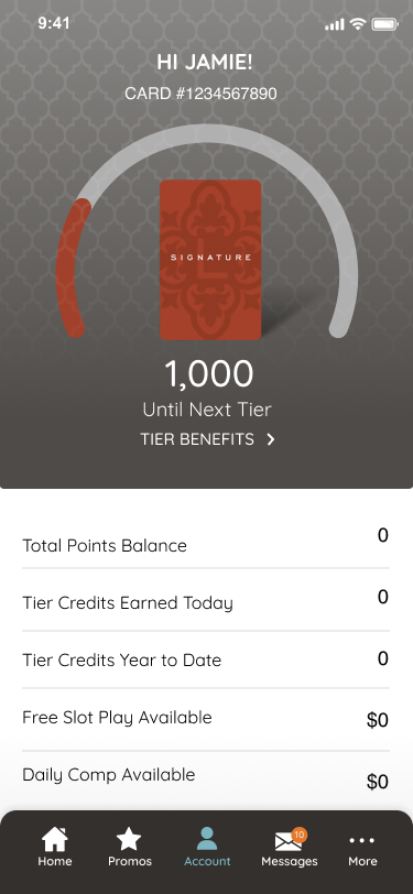
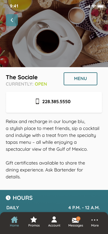
Instead of a from-scratch redesign, I performed a strategic brand overlay using Everi's core white-label engine. By applying del Lago's specific visual DNA—custom iconography, tailored typography, and their signature color story—to our existing optimized UI, I transformed the experience into a "personalized concierge." This allowed us to deliver a massive UX upgrade with maximum technical efficiency.
Leveraging our pre-built, UX-optimized mobile framework to deliver maximum deployment efficiency.
Experimenting with diverse color ratios and typographic combinations.
The primary goal was to demonstrate the efficiency of our white-label ecosystem. I utilized our pre-built, optimized UI components to ensure a stable and fast deployment, focusing my efforts on the "visual translation layer" to ensure the final product felt like a custom del Lago application rather than a template.
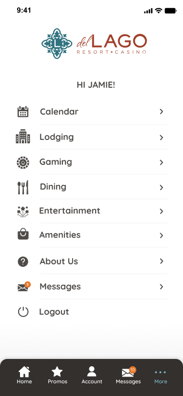
I conducted an extensive visual exploration phase to find the perfect balance between the brand's luxury resort aesthetic and mobile usability. I experimented with various combinations of del Lago's teal and copper palette, testing how different color ratios affected button prominence and readability. This exploration led to a high-contrast layout that uses the signature teal as a primary anchor and copper as a sophisticated accent for active states and notification badges.
By applying our refined framework and running targeted design QA on the del Lago project, we systematically solved the critical friction points found in their old design:
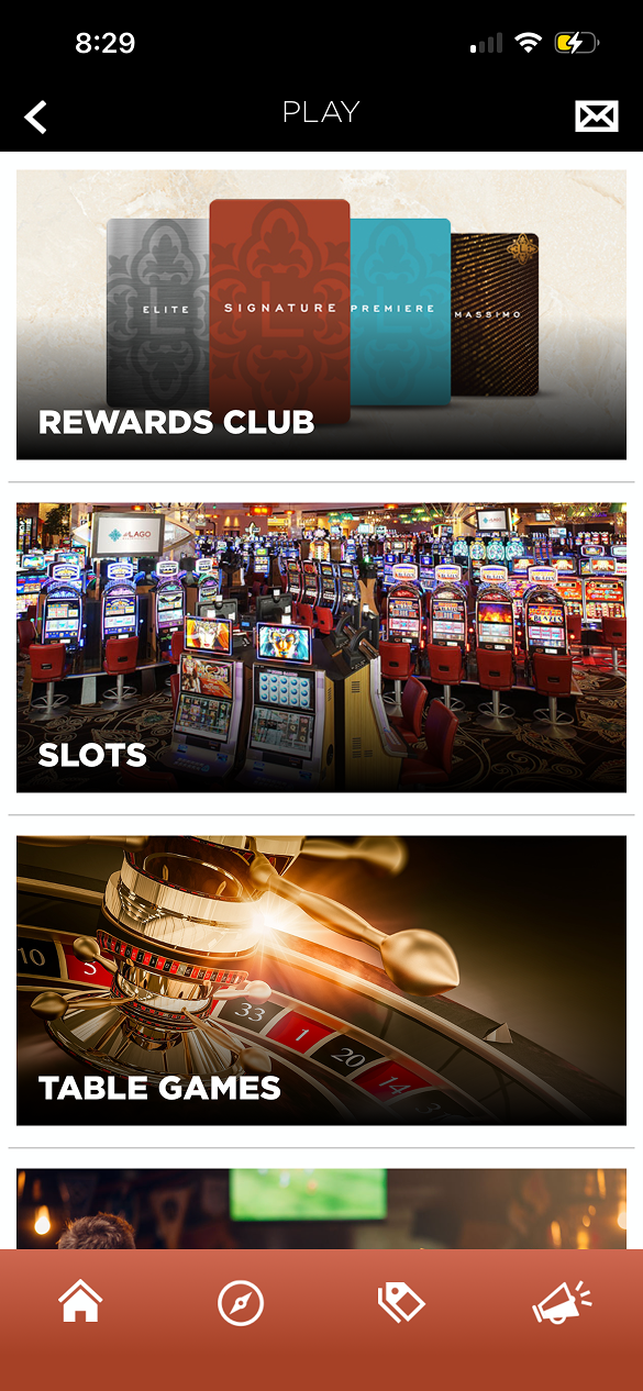
From Manual Lists to Systematic Grids: We replaced their overwhelming 10+ item text list with our framework's icon-driven dashboard. This inherently organized their services into a scannable, modern interface.
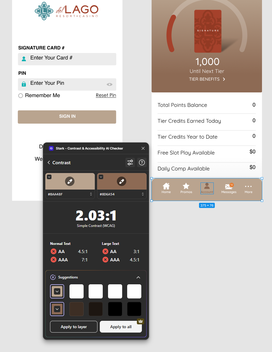
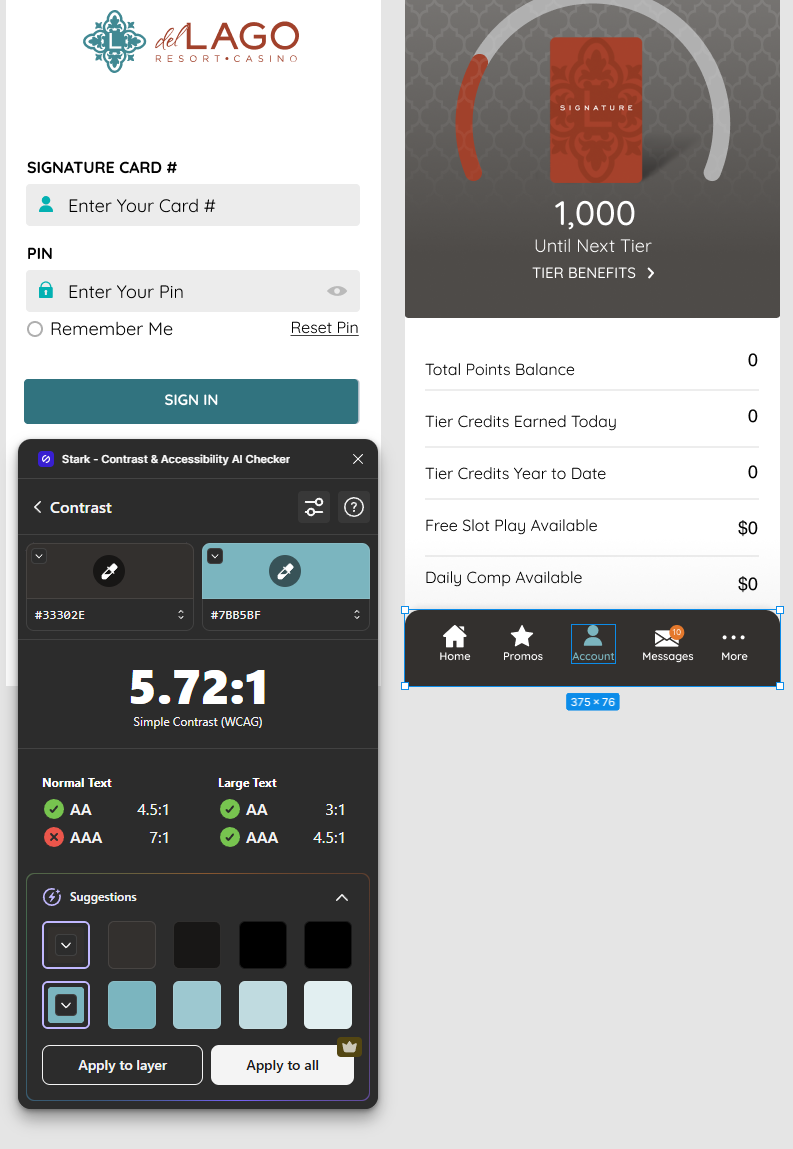
Data-Driven Accessibility Compliance (Stark Plugin QA): Casino branding frequently utilizes metallic or warm tones like copper, which can introduce severe legibility issues on mobile screens. During my visual exploration phase, I used the Stark plugin to rigorously audit my color styles on the global persistent bottom navigation bar:
The Fail State: My initial exploration combined a copper background (#BAA48F) with a muted accent surface (#8D6A54), which yielded a critical contrast failure of 2.03:1, failing both AA and AAA standards for normal and large text.
The Pass State: To resolve this without losing the brand's premium identity, I shifted to a high-contrast, dark-themed nav bar background (#33302E) paired with a vibrant, accessible version of del Lago's brand teal (#7BB5BF). This adjustment successfully boosted the contrast ratio to 5.72:1, clearing WCAG AA compliance standards and ensuring high readability for all app users on the casino floor.
To make our global update process highly efficient, I relied heavily on pre-configured global Color Styles and Text Styles. This allowed me to swap the foundational visual theme rapidly across the entire file without manually altering individual assets:
| Design Vector | Everi's Optimized Framework | del Lago Mapping Strategy |
|---|---|---|
| Navigation | Persistent Bottom Tab System | Integrated Accessible Teal Active States over a Dark Theme Background |
| Layout | 3-Column UX-Tested Grid | Populated with del Lago "Play/Stay/Dine" Content |
| Typography | Shared Text Styles | Reconfigured global styles to a modern Sans-Serif reflecting resort luxury |
| Color Theory | Shared Color Styles | Overrode primary/secondary styles with del Lago's Teal & Dark Hue |
| Visual Assets | Component-Based Card Slots | High-quality resort photography & Teal Crest branding |
The del Lago project successfully demonstrated how an established white-label framework can deliver a premium, tailored product without requiring a from-scratch build. By executing a meticulous visual exploration phase, utilizing global color and text styles, and validating contrast ratios with the Stark plugin, I successfully mapped del Lago's brand identity onto our existing, optimized layout. This approach allowed us to launch a highly polished, cohesive guest experience that significantly elevated usability while protecting the underlying framework stability—proving that efficiency and aesthetic excellence can seamlessly coexist.
Final Del Lago Design