Mobile Design
2019
Group n Go!
From 'maybe' to 'booked.' All your group's ideas and votes in one happy place.
From 'maybe' to 'booked.' All your group's ideas and votes in one happy place.

In this project, I designed an app that helps travelers and their social groups plan an outing and choose the right location with less effort. While many travel websites and apps support trip planning, they often fall short when it comes to helping groups narrow down options and feel confident in making a final decision.
Developed as my final capstone project for the Springboard UX/UI Design Program, this was a solo project focused on creating a streamlined product that reduces the stress and confusion common in group planning. Throughout the process, I incorporated feedback from testers to keep the solution user friendly and effective.
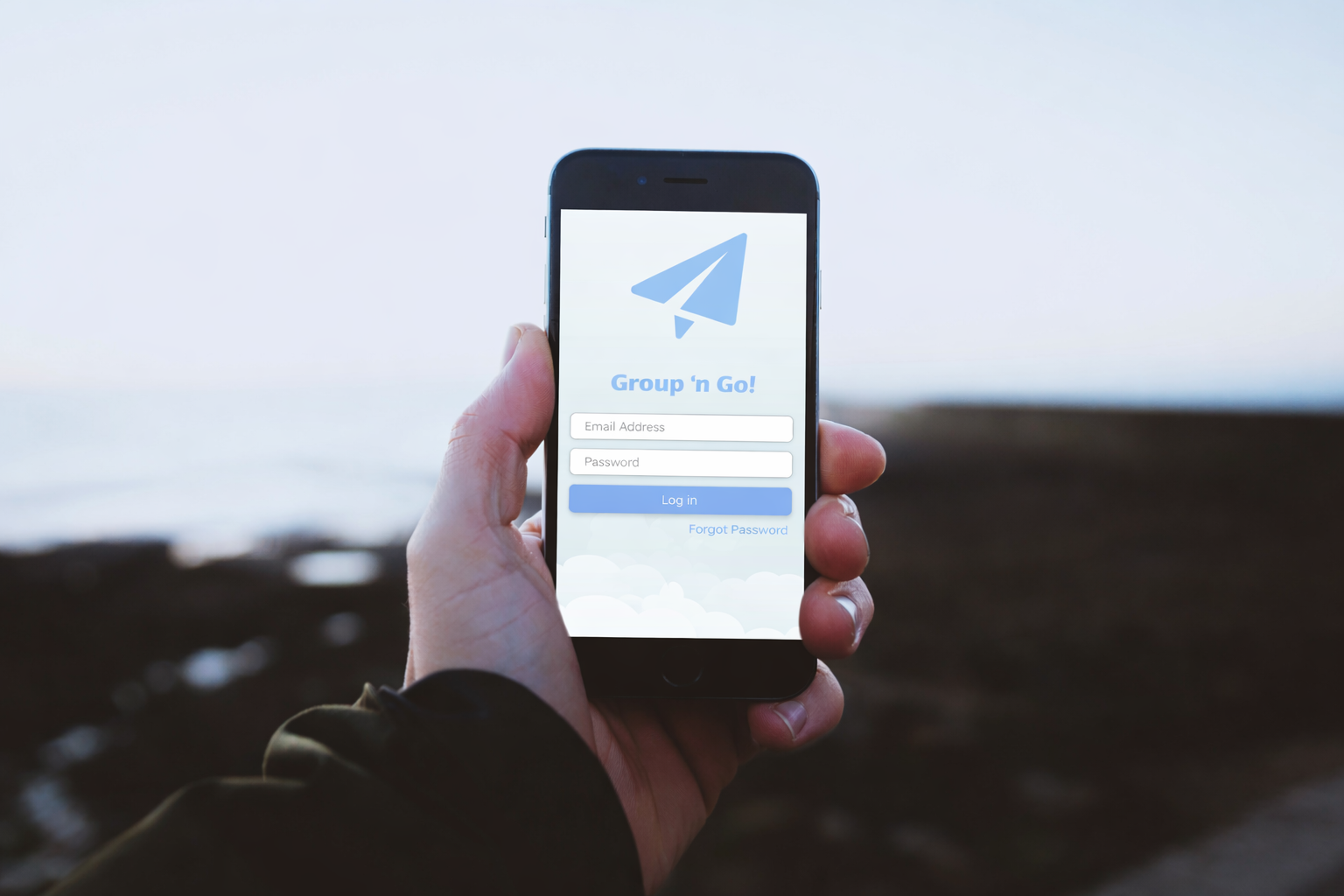
Travel planning lacks an integrated way to gather group input and compare options, which leads to decision fatigue and social friction. I felt this while coordinating a cross country trip with friends. We bounced between tabs, shared links that got lost in group chats, and struggled to agree on flights and stays. Without one place to collect preferences, weigh tradeoffs, and decide together, planning becomes stressful before the trip begins. Group travel planning feels scattered and overwhelming, when it should be seamless and collaborative.
Make it easier to agree as a group
Users could find many options quickly, but they did not have a simple way to agree on one without long back and forth. To address this, a group chat was created where everyone could discuss options in one place, share reactions, and confirm the final choice.
Make tradeoffs visible early
In group chats, decisions can spiral without structure. Cost, travel time, and vibe often came up late, usually after someone dropped a link, which led to rework and frustration. I introduced quick surveys and polls so everyone could weigh in upfront and the group could align faster.
Keep planning context in one place
Help people track multiple group chats while keeping the itinerary, notes, links, and preferences together, so the group does not lose the context behind each option.
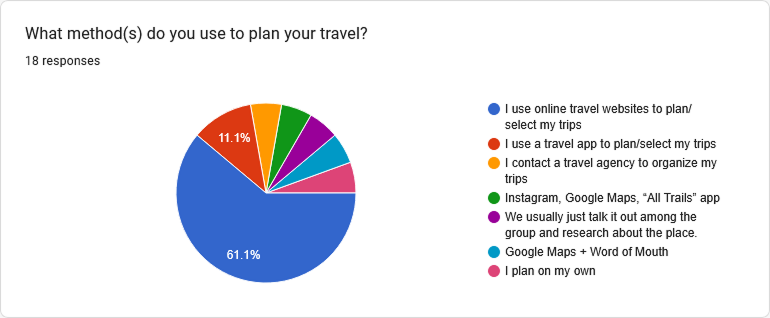
To move beyond my personal experiences and validate the need for a better travel tool, I conducted a dual-phase research study. I started with a Google Forms survey of 18 participants to gather quantitative data on travel habits, followed by in-depth user interviews to uncover the emotional and logistical friction points of the planning process. (Multiple-choice, ordinal scale)
Key Findings
Insight 1
Over 72% of respondents travel in groups, yet they lack a centralized way to coordinate.
Insight 2
Exactly 50% of users spend weeks or months planning a single trip, proving that a 'quick search' tool isn't enough — users need a long-term 'command center.'
Insight 3
While 61% start with travel websites, they quickly pivot to a 'Frankenstein' mix of Google Maps, Instagram, and group chats to manage details.
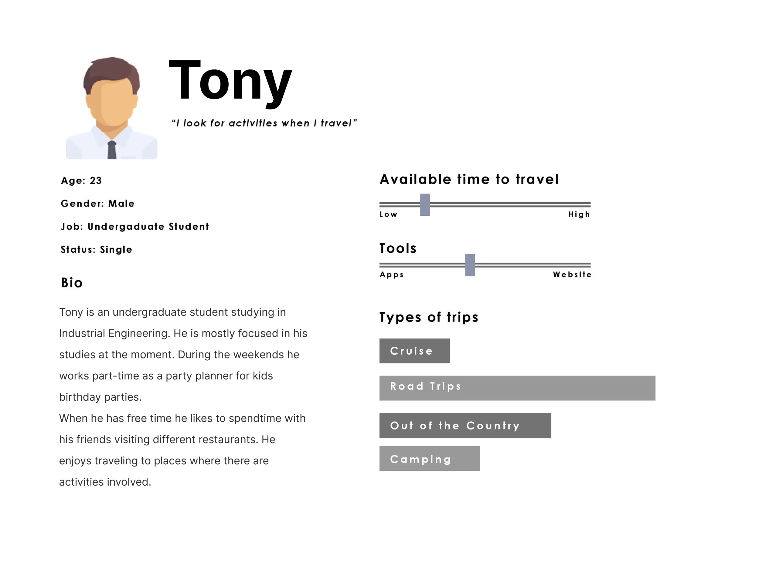
To frame my design decisions around real people — not assumptions — I synthesized my research into two personas. Tony and Hazel represent the most common archetypes I discovered: the Overloaded Organizer who gets stuck in the logistics, and the Enthusiastic Follower who wants to contribute but lacks a clear channel to do so.
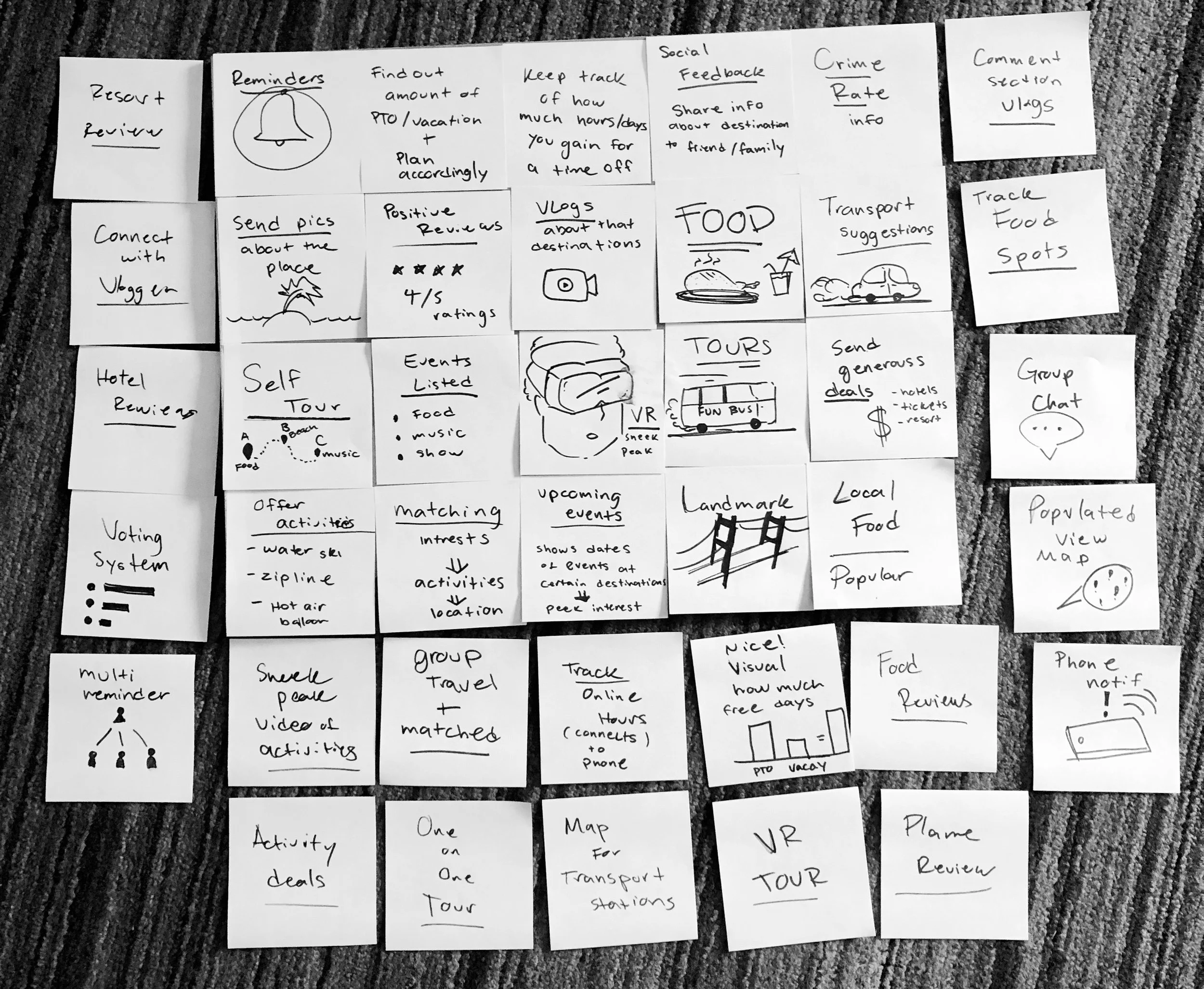
To bridge the gap between research and design, I conducted a comprehensive brainstorming session to map out potential solutions. These quick sketches allowed me to explore a wide range of features — from logistical tools like PTO trackers and voting systems to experiential content like VR previews and local food guides.
As a key milestone in my Springboard UX/UI capstone project, this exercise was essential for visualizing how to centralize fragmented travel data. By laying out every touch point of the group journey, I could identify which high-impact features would best reduce social friction and help users move from "searching" to "deciding" with total confidence.
Early phase sketches — the building blocks that helped shape the Group n' Go app.
When the host creates a group and adds recipients, they can set up a quick survey. The app suggests built-in, generic travel destinations to get the conversation started, and the host can later refine them into more detailed, specific options. Each member responds directly in the app, so preferences stay in one place instead of getting lost in group chat.
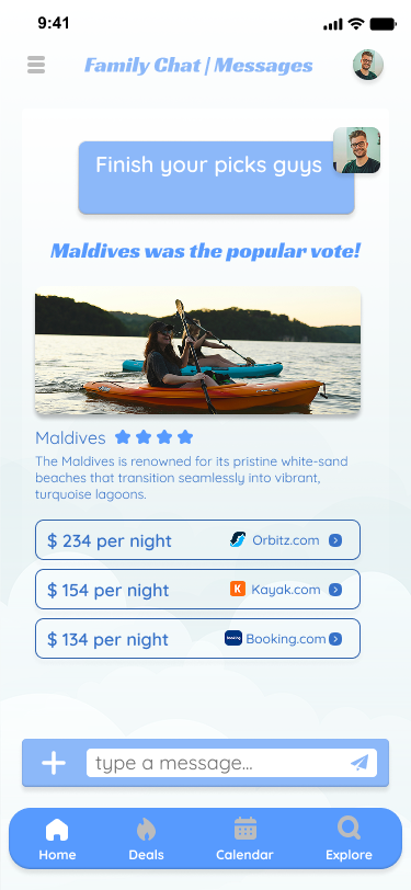
Once everyone has voted, the app automatically summarizes the results. It highlights the destination with the most support and confirms the group's choice, creating a clear decision moment that moves the group from discussion to action.

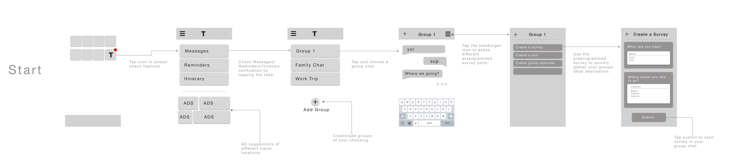
I created a low fidelity wireframe that maps the core flow from entry to survey completion. Users open the app from the home screen and land on a main menu with three tabs — Messages, Reminders, and Itinerary. From Messages, they select a specific group chat (for example, Group 1) and enter a standard messaging interface. Inside the chat, a hamburger icon opens a utility menu with three options: Create a survey, Create a poll, and Create a group reminder.
When the user selects Create a survey, they move into a simple setup screen where they choose date ranges (for example, June or July) and destinations (for example, Beach or Cancun). Tapping Submit posts the survey directly into the group chat so the group can start voting immediately, without switching apps.
I kept navigation intentionally simple through the tab system, and I integrated planning tools directly into chat to reduce context switching. I also reserved space for contextual ads below the main navigation — such as travel location suggestions — so recommendations feel relevant to what the group is planning.
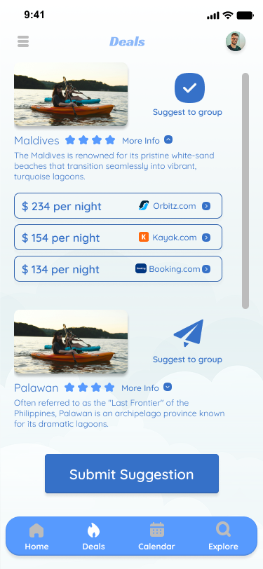
In the high-fidelity phase, I evolved the structure from my lofi wireframes into a polished, high-touch interface focused on contextual accessibility and cognitive efficiency.
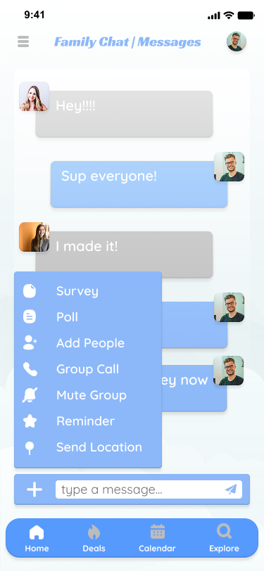
To reduce friction in the flow of conversation, I moved the planning tools — surveys and polls — out of the hamburger menu and into a primary plus action icon inside the message input. This matches common messaging app patterns, so the collaboration tools show up where planning actually happens, in the chat, instead of being hidden in settings.
I also simplified the survey to focus only on destination discovery. I removed date selection because that decision is handled better as a poll. Keeping the survey single-purpose makes it faster to complete, so groups can keep momentum while planning. The final UI maintains a calm design approach with intentional white-space and a clear visual hierarchy, ensuring the main tasks stay front and center even with contextual travel suggestions.
The final UI uses a calm, travel-friendly visual style that keeps the group focused on making a decision, rather than getting pulled into endless browsing. I centered the experience around readable cards, clear criteria chips, and a consistent layout so users can compare options quickly without having to re-learn the interface each time. Color and emphasis distinguish groups and make it easier to track the details that matter. Each UI choice reduces cognitive load and helps the group feel confident about the final pick through a quick, seamless process.
I focused on a minimal design to create a sense of ease and focus — counteracting the chaos often associated with trip planning. The goal was to build a single source of truth for travel details, providing a much-needed sense of control for those who feel overwhelmed by logistics. Whether for an individual or a group, the interface replaces constant back-and-forth communication with a shared, organized space.
More case study content coming soon.