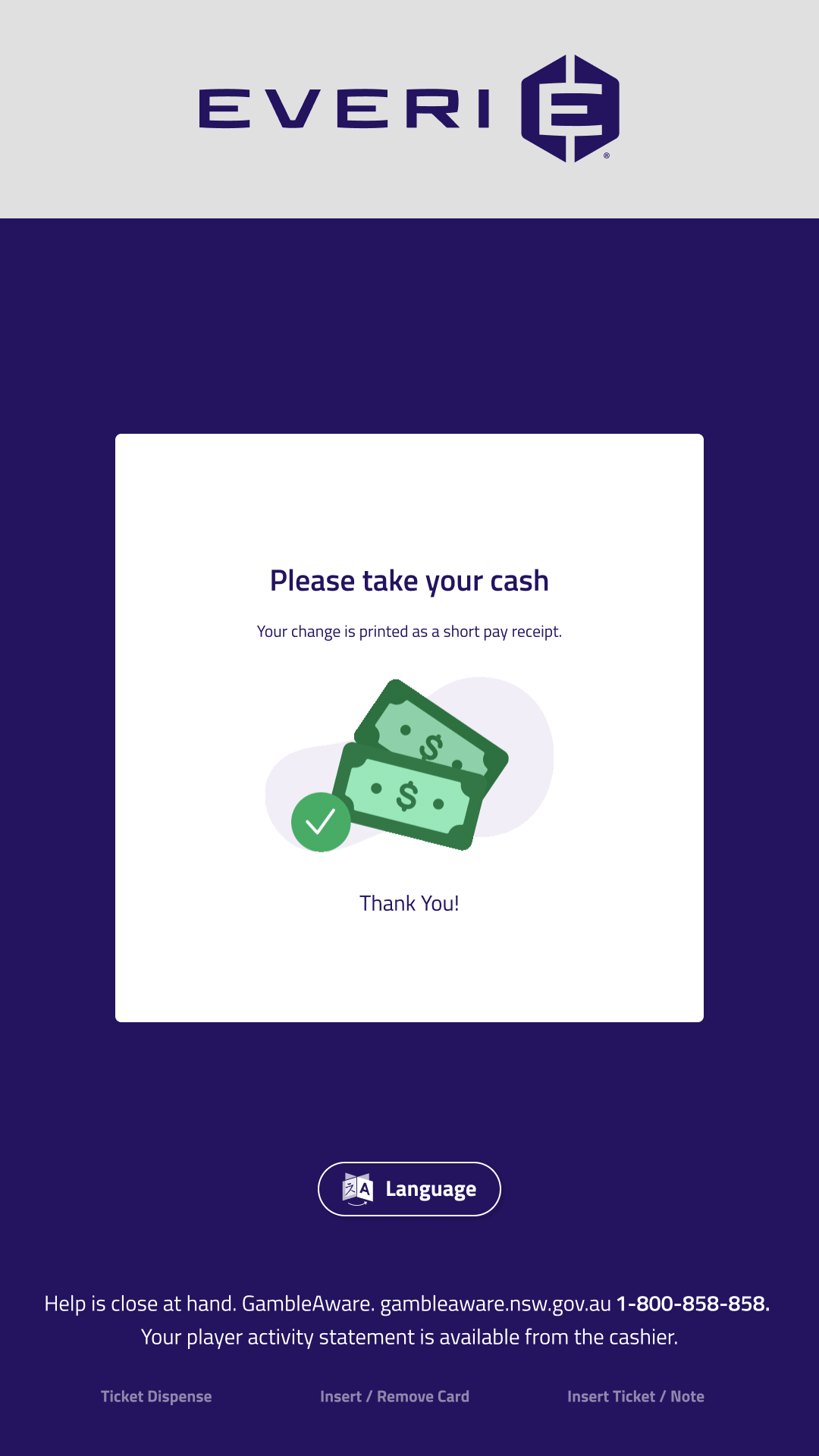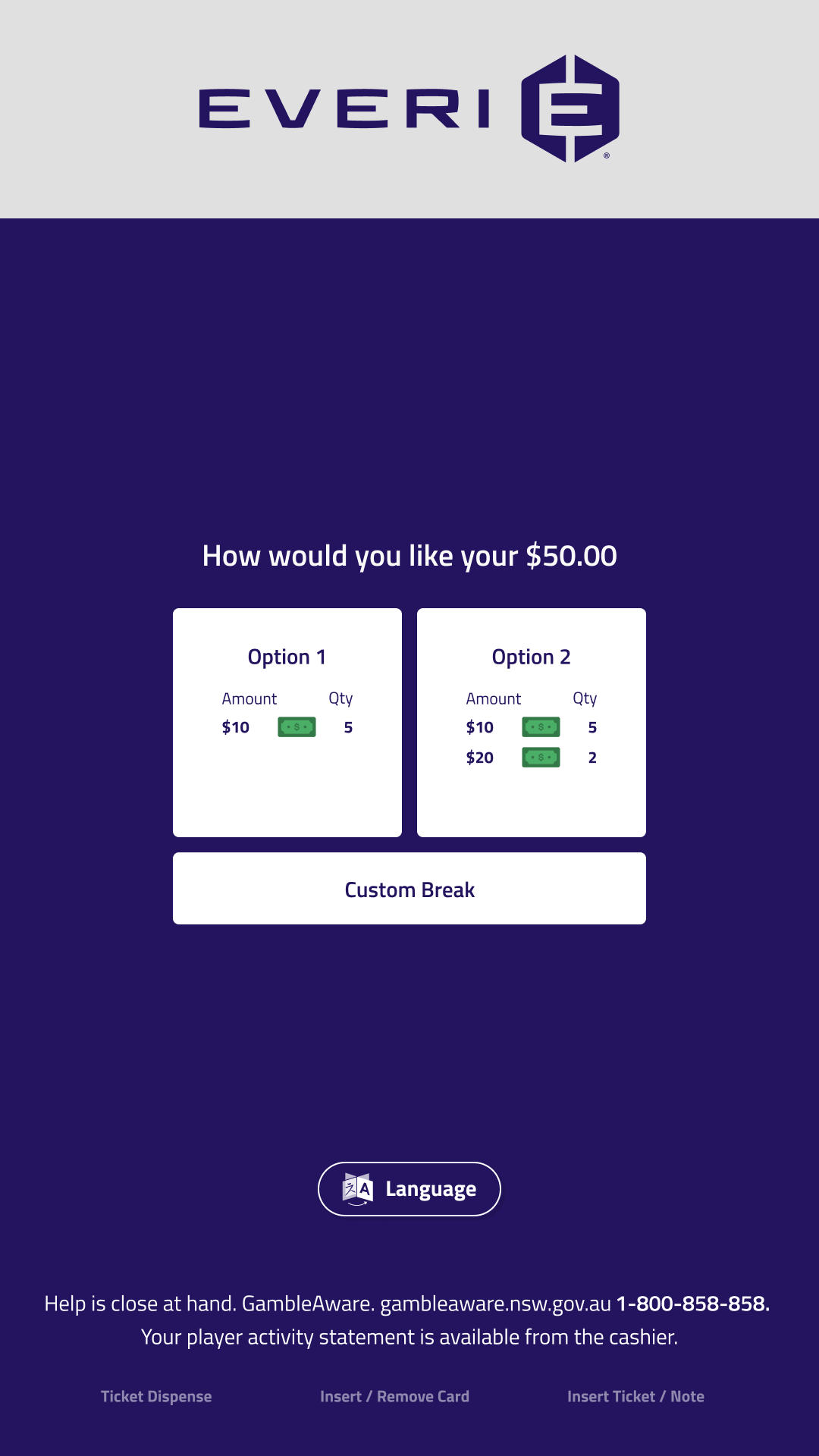
eCash x Everi
UX/UI Design 2025

Responsive Casino
Kiosk Redesign

Redesigning South Australia's kiosk ecosystem with a responsive UI system optimized for diverse hardware.

Role

Lead UX, UI Designer

Tools

Figma, Lottie, Jitter, Maze

Team

3 UX/UI Designers, 4 Devs, 3 PDMs

Overview

The Challenge

As a UX/UI Designer II at Everi Holdings Inc, I led the end-to-end redesign of a casino kiosk ecosystem for our client in South Australia. The primary challenge was developing a single, high-performance solution capable of delivering absolute UI consistency across a diverse range of hardware.

I focused on optimizing the user journey by first improving navigation and visual hierarchy to ensure the interface scaled effectively. By incorporating a responsive design framework, our team delivered an intuitive and accessible system that maintains its integrity across all screen dimensions and hardware configurations.

Hardware

The Machines

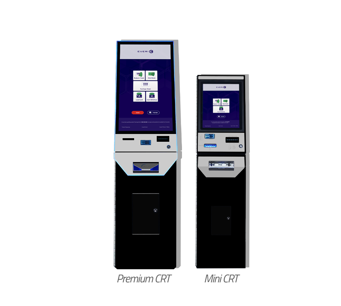
Premium CRT

  • The Hardware: A flagship terminal designed to elevate cash redemption with a stunning, large edge-lit screen and an elegant design that combines speed and advanced graphics.
  • Resolution: 1080 × 1920 (Vertical HD)
  • Core Features: Deposit and withdraw cash, bill breaking, ticket redemption, and ticket purchasing.

Mini CRT

  • The Hardware: A cost-effective redemption solution with an ultra-small footprint tailored for smaller AWP and VLT venues, maintaining all key gaming features and industry standards.
  • Resolution: 1024 × 1280 (Standard 5:4)
  • Core Features: Deposit and withdraw cash, bill breaking, ticket redemption, and ticket purchasing.
Premium CRT and Mini CRT kiosks
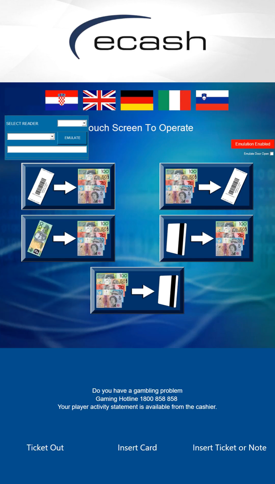
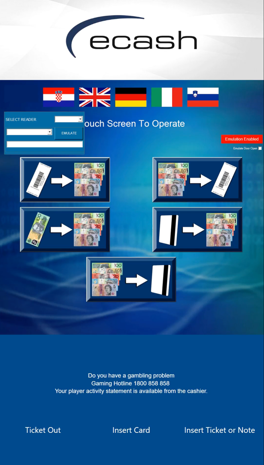
Original UI Design

Original UI Design

Problem

The Challenge

South Australia's existing gaming interface was hindered by an aging UI that no longer met modern industry standards or user expectations. The legacy system created friction for operators and lacked the visual clarity needed for high-stakes, high-speed environments. I was tasked with leading a comprehensive redesign to modernize the aesthetic while significantly improving functional efficiency.

Goals

The redesign needed to solve two problems at once, usability issues that affected guest confidence, and a layout that could adapt across different kiosk sizes. The business needed a consistent kiosk experience that reduced assistance requests and minimized costly interaction errors. Users needed faster way-finding, clearer next steps, and interfaces that work reliably with touch in a busy casino environment. I also wanted to create a UI foundation that future features could extend without requiring a full redesign each time.

Goal 1

Find areas of improvement by testing old UI

Goal 2

Apply enhancements in the areas

Goal 3

Make design responsive

Maze Test Research

To make sure the new layout really worked, we used Maze to test the most important parts of the experience—from the feature-rich home screen to complex, technical flows like the Cash Breakdown. This was our chance to see if our new labeled buttons and structured layout actually made sense to people in practice.

The testing confirmed exactly what we hoped: guests were much faster and didn't hesitate like they did with the old UI. It proved that our responsive system kept things clear and easy to use, whether someone was interacting with the Premium machine or the Mini.

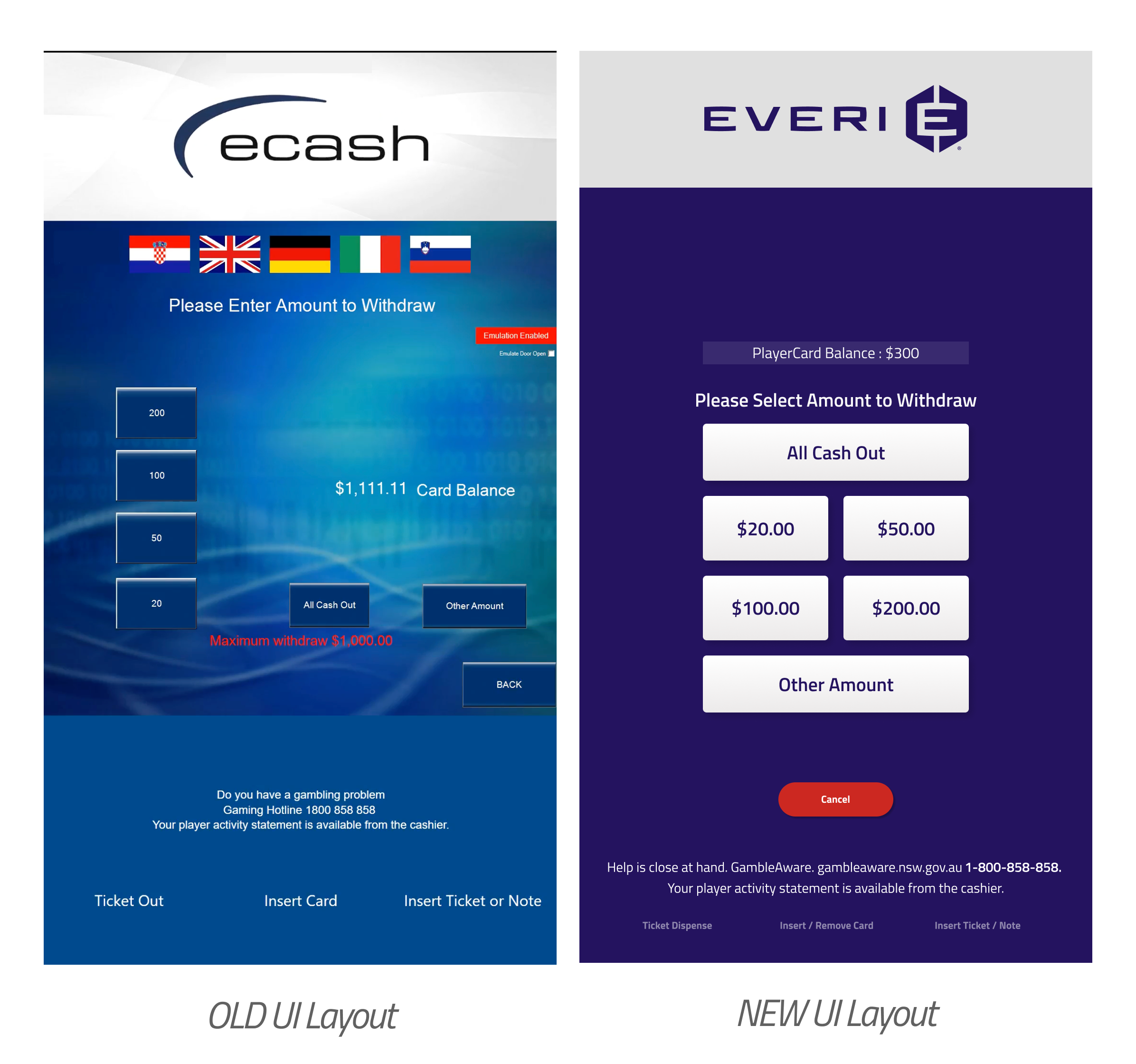
Areas of Improvement

The Maze tests our team ran helped me pinpoint which parts of the experience needed refinement. I used the results to prioritize changes that improved clarity and usability, while still meeting South Australia's (our client) restrictions.

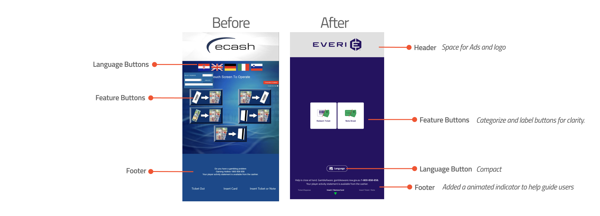
Before and After UI comparison
Enhancements

1. Header and footer

Adhering to South Australian regulations, I designed a consistent header and footer system mandatory for all kiosk flows. The header serves as a hub for branding and sponsored content, while the footer provides essential responsible gambling messaging and hardware-specific guidance.

The key enhancement was the implementation of a fixed-scale, ensuring these navigational anchors remain stable and predictable throughout the entire user journey. To further bridge the gap between the digital interface and physical hardware, I integrated animated inverted triangle icon within the footer. These serve as dynamic directional cues, intuitively guiding patrons on exactly where to insert tickets or cash and where to collect their dispensed currency.

Header and footer animation
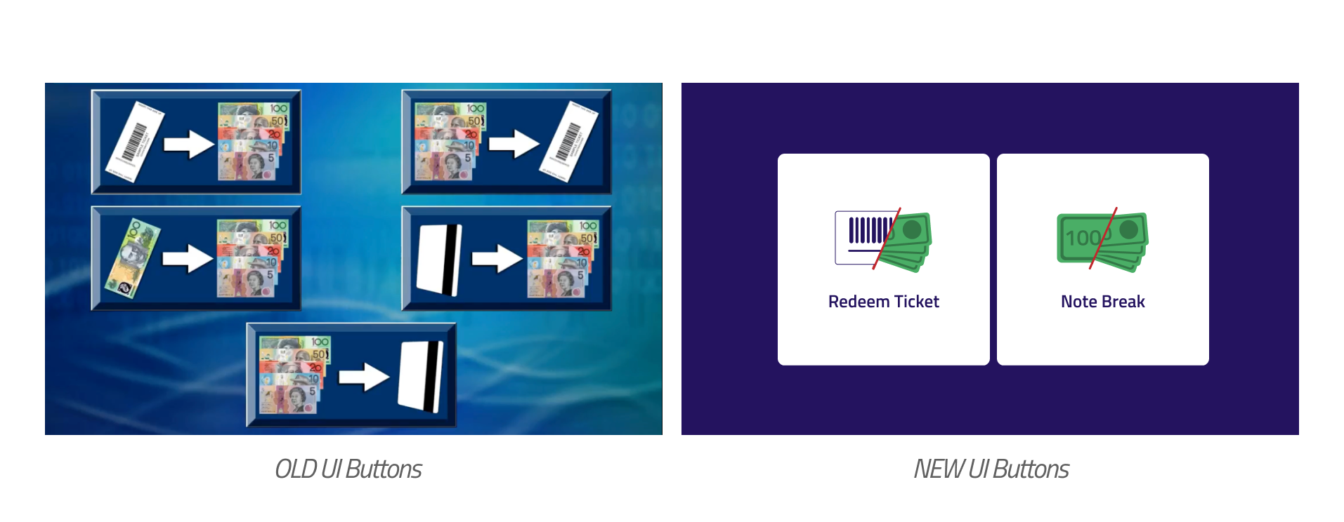
Old and new UI buttons comparison

2. Buttons

The original interface had outdated, scattered buttons with no cohesive structure. It also lacked text labels, forcing users to guess functions from icons alone.

I redesigned the button system with a modern visual style and a clearer layout. I added concise labels to every action, removing guesswork and making each button's purpose instantly clear. This improved the standing interaction experience, helping patrons use the kiosk faster and more accurately.

3. Organization

The original Withdraw screen lacked a clear layout, with key transaction details and action buttons scattered across the display. This caused hesitation and confusion during the most sensitive part of the kiosk experience. This issue appears on other screens as well.

I redesigned the screen with a consistent, top-to-bottom information hierarchy to prioritize speed and accuracy. By grouping related actions and using compact, predictably placed buttons, I made the most important details the first thing users see, helping them confirm selections and complete withdrawals with confidence.

Old and new UI organization comparison
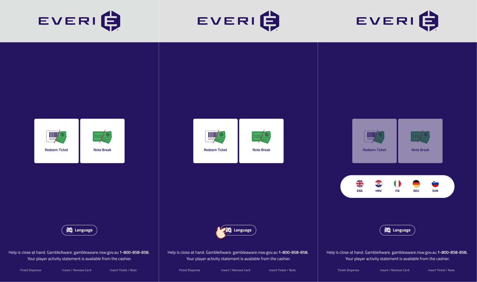
Language button interaction

4. Language button

The language button needed a better way to be displayed. In the old UI it appeared on every screen. While that made it easy to find, it also took up space and stayed visible even after a patron had already selected their preferred language on the first screen.

I improved this by grouping language selection into a single button. Patrons tap it once to choose their language, then continue without the language control staying on screen.

Responsive Approach

I worked closely with our developers to make the final design adapt smoothly across both hardware types. We tackled it in three stages. First, we broke the screen into clear regions, like header, footer, and the main content area, to control how each part should behave. Secondly, we applied percentage based scaling within those regions so key assets resize proportionally without breaking the layout. Last, we defined responsive text rules so typography scales and flows consistently.

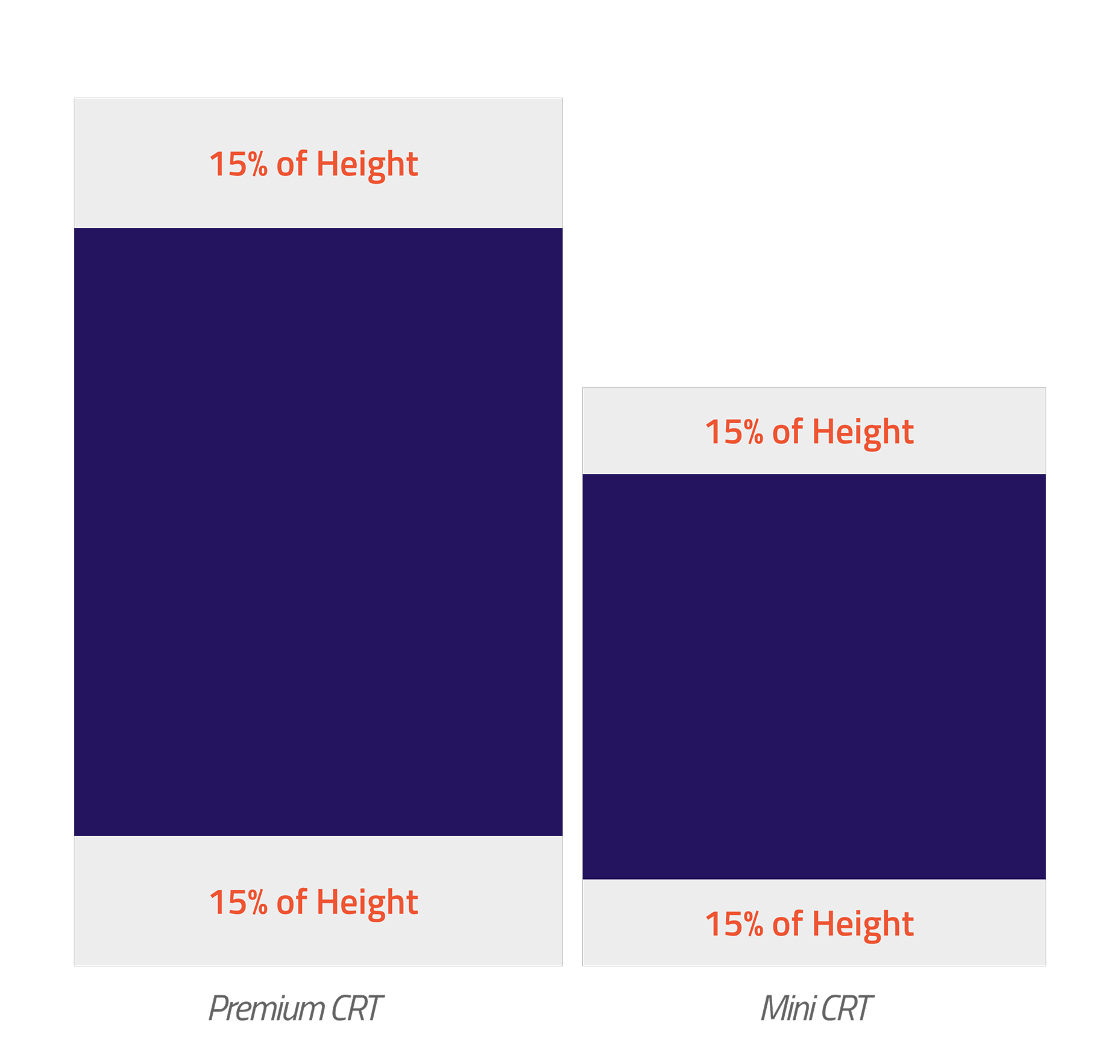
Header and footer percentage breakdown — Premium CRT and Mini CRT

Header & footer

Based on South Australia requirements, we allocated 30% of the screen to the header and footer. We split this evenly so both areas had enough space for brand logos and ad placements, while still clearly displaying the gambling message and compliance indicators. Even though we considered giving either the header or the footer more space, we decided they both needed equal room. Keeping the same percentage for each also made the layout easier to scale responsively.

Main container

The main container is the space between the header and footer. It holds the primary sections of the screen and supports key features and content, including buttons, text, pop ups, keyboards, and other UI elements. In this layout, it takes up the remaining 70% of the overall screen.
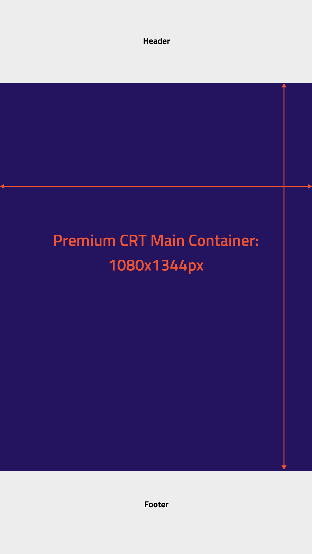
Main container — Premium CRT layout with annotated regions
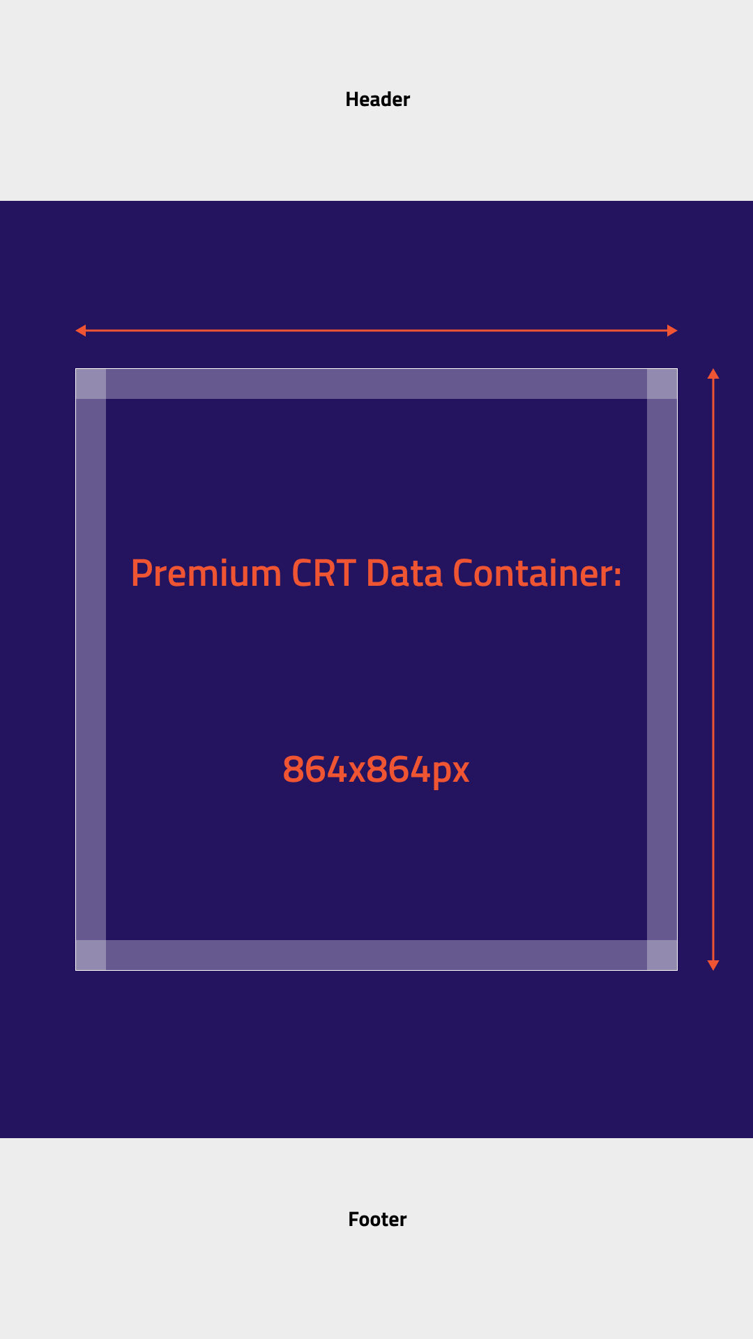
Data container — Premium CRT Data Container 864x864px

Data container

The data container scales responsively with the main container. We set its width to 80% of the main container's width, and matched the height to the same value to keep it square. This helps the content and visual assets scale proportionally across breakpoints.

To keep the layout predictable, we used static positioning and center aligned the data container within the main container. Inside the data container, we applied consistent padding between 5% and 10% (about 44px to 86px), adjusting within that range based on how much content the container holds.

Tile container

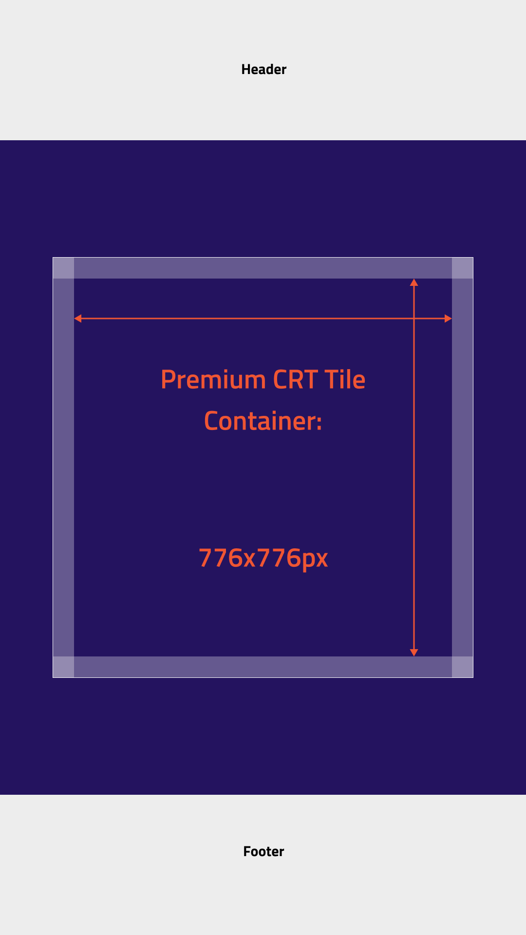
The tile container is the space inside the data container. It holds the kiosk's key features and assets.

Tile container — Premium CRT Tile Container 776x776px

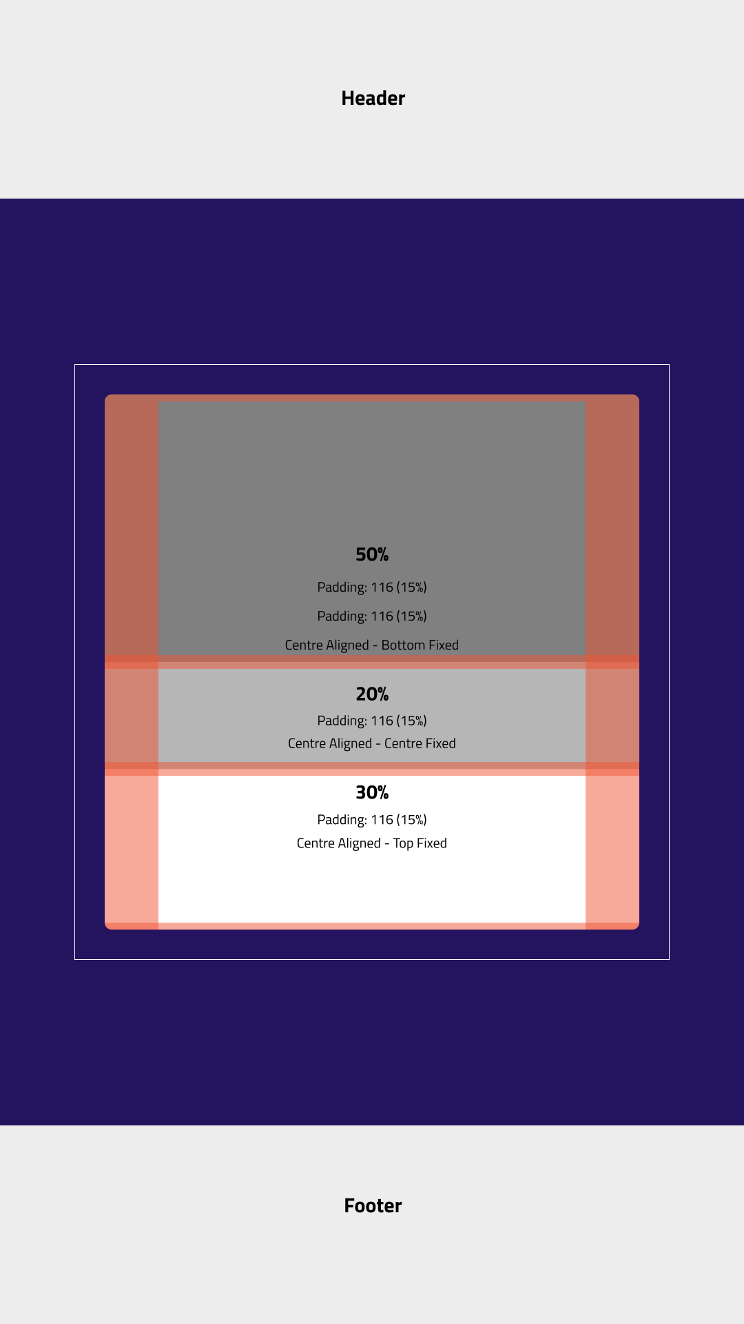
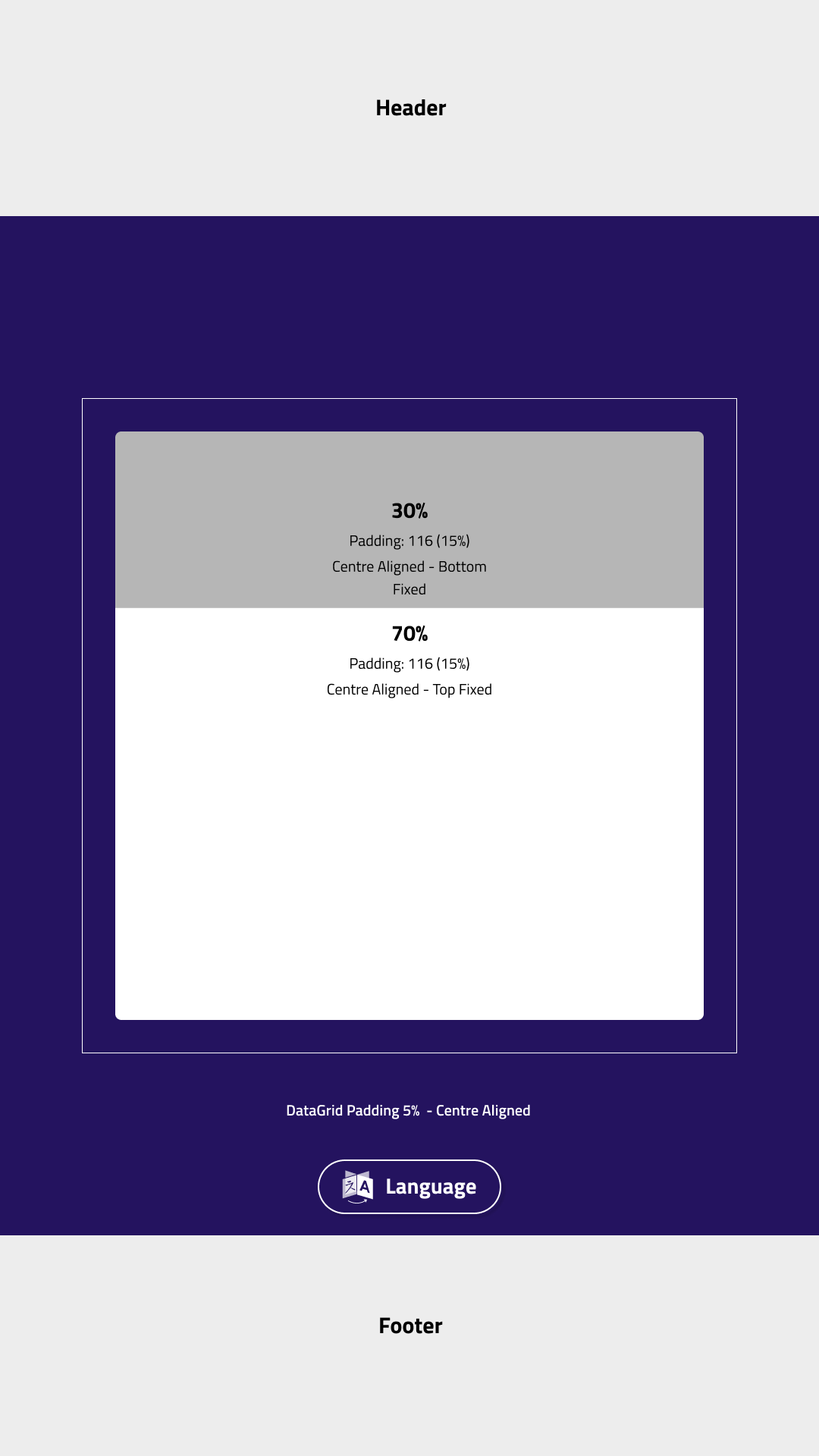
Tile Variants

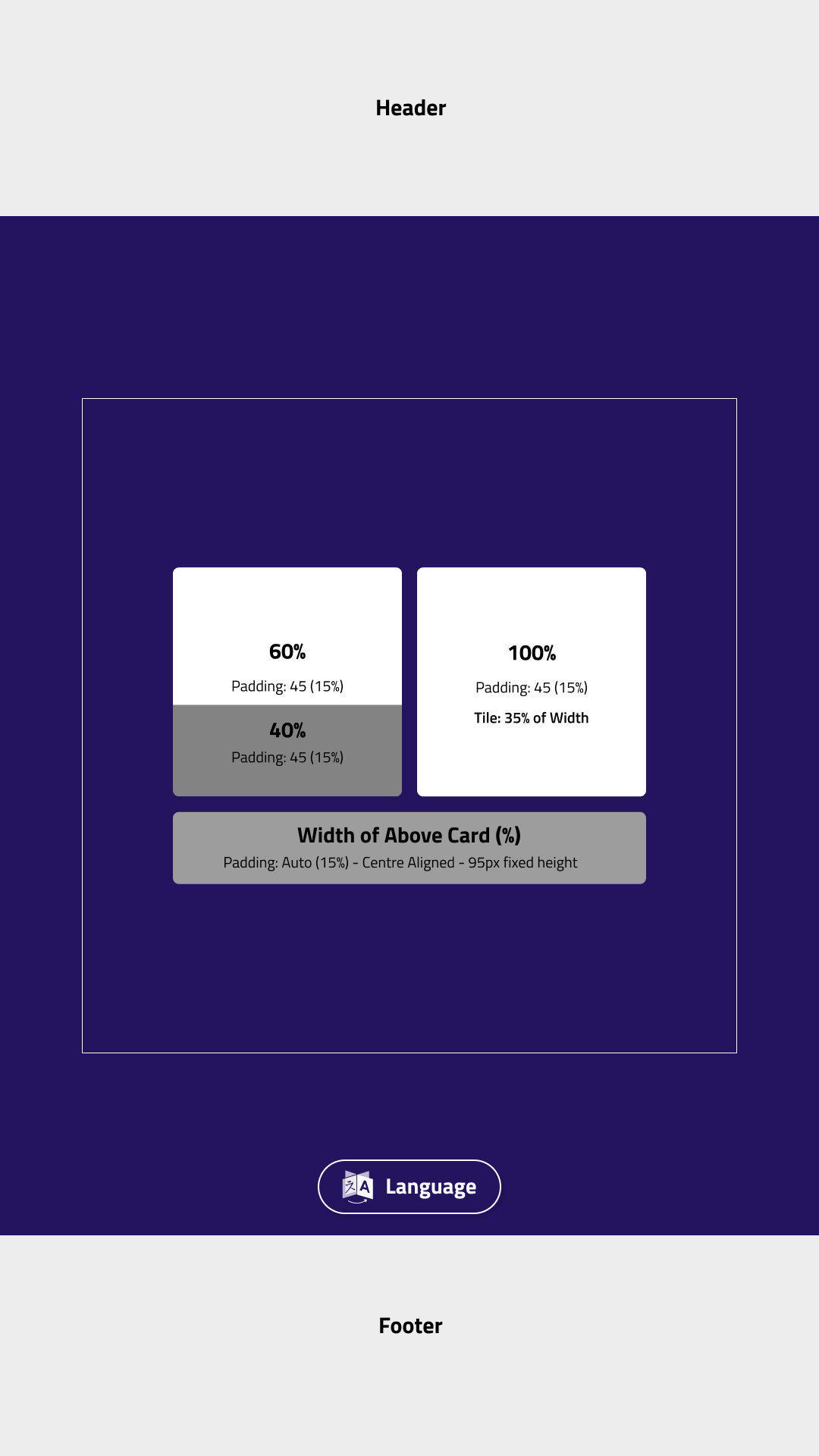
The tile inside the data container has multiple variants, depending on how much feature content it needs to display. To keep the layout consistent, I suggested splitting the tile into defined sections, similar to how our developers proposed dividing the full screen into percentage based areas. This makes the tile behavior predictable and keeps alignment consistent across all screen types. Each section has a fixed position, which I documented in my specs so developers can quickly reference it during implementation.

Variant 1

Variant 1

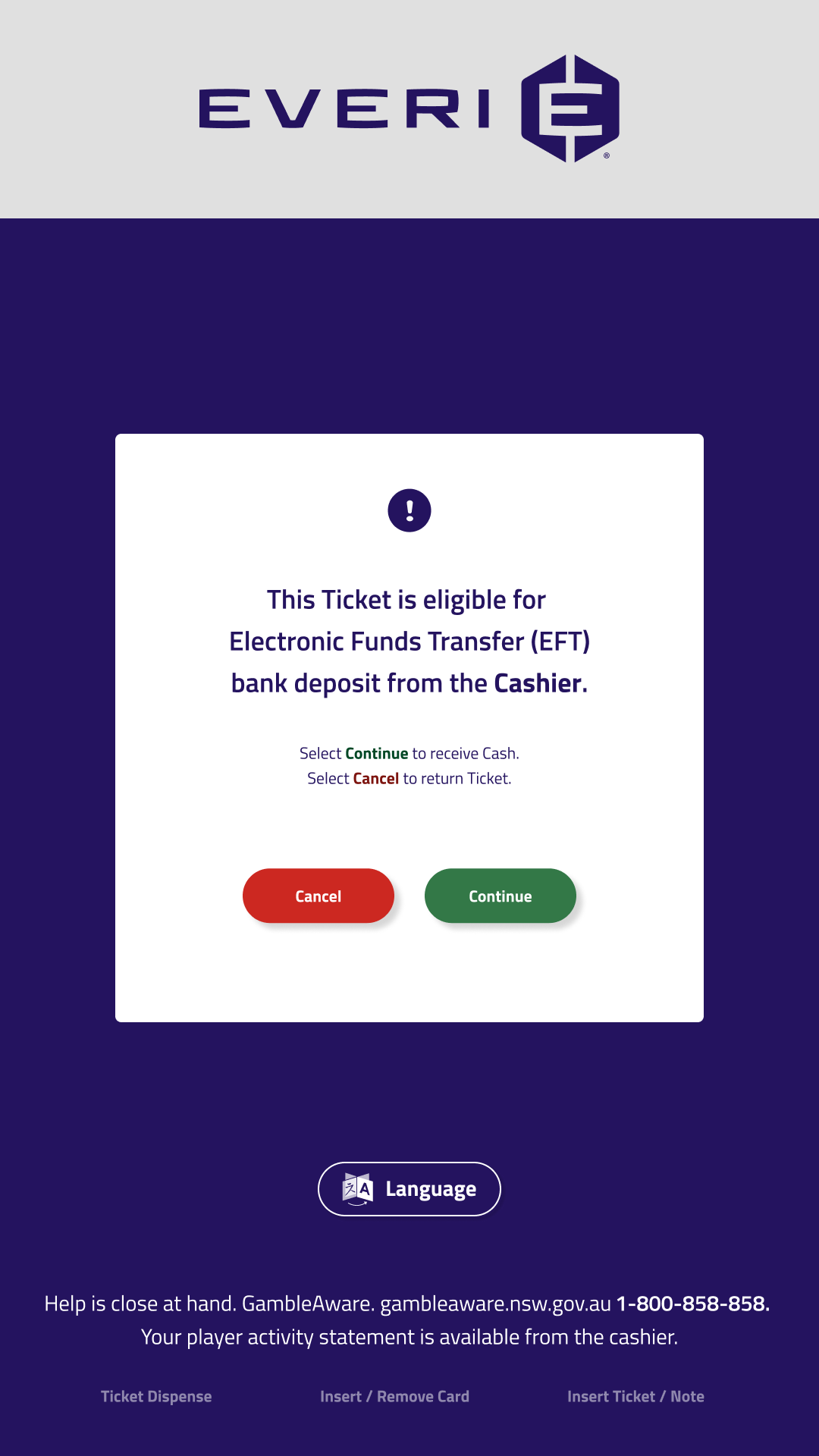
Variant 1 Variant 1 Variant 2 Variant 2 Variant 3 Variant 3
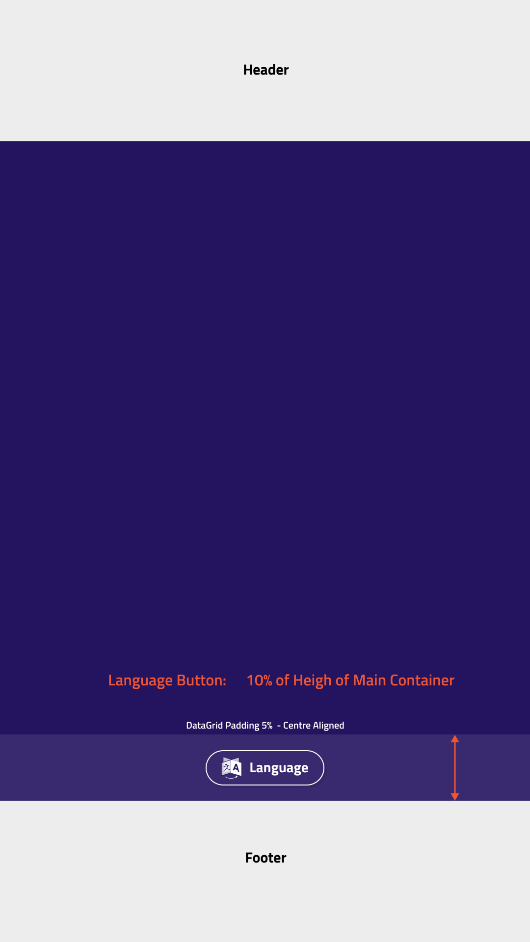
Language button — 10% of main container height, center aligned

Language button

The language button takes up 10% of the main container's total height. The data container fills the remaining 90%. The button is statically positioned and center aligned.

Font Sizing

Designing for different screen dimensions requires more than just scaling images; it requires a systematic approach to typography to ensure readability and consistency. In collaboration with the development team, We designed a three-step method to handle font scaling across both the Premium and Mini CRT displays.

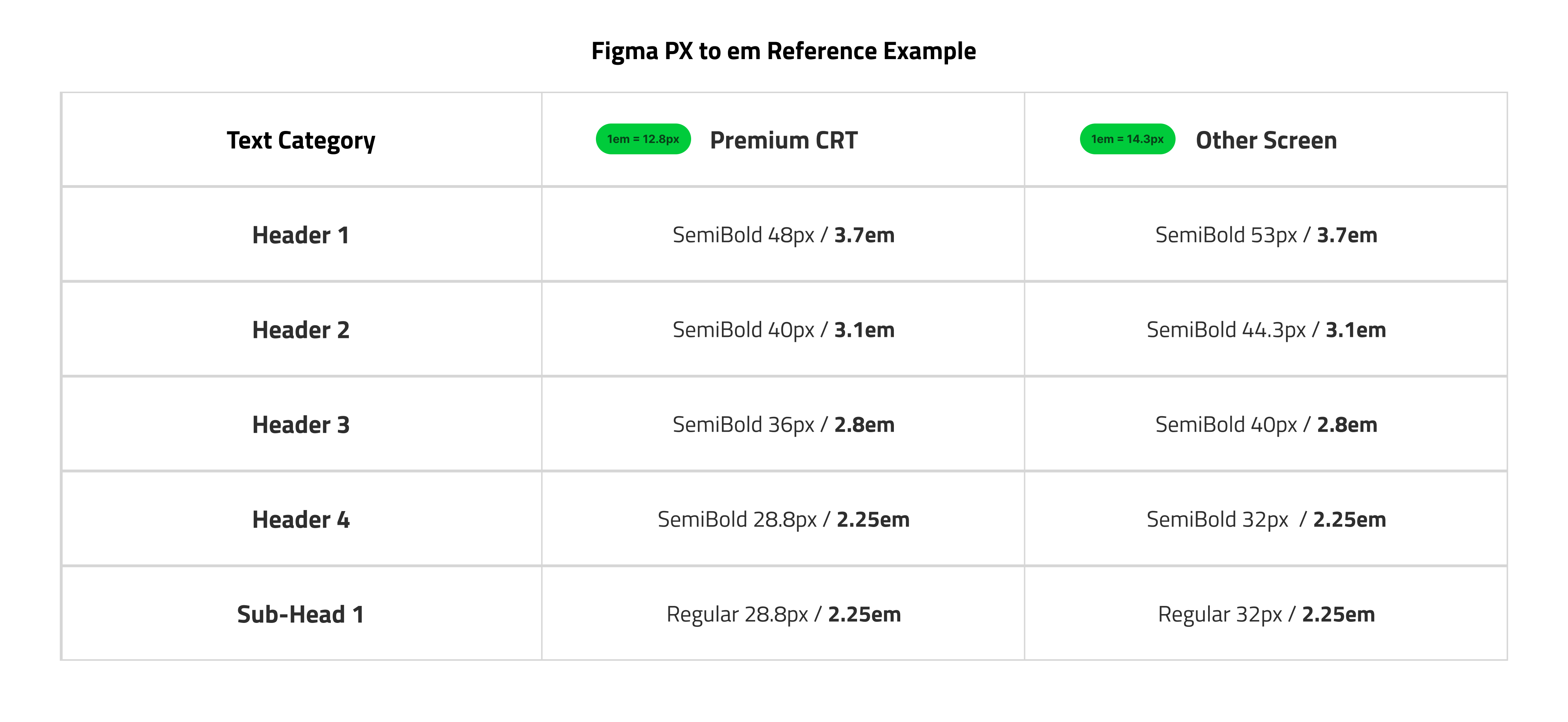
Font size reference table — Premium CRT vs other screen em values

Figure #1 — Reference Example

Step 1: Establishing the Baseline

We used em units for text rather than fixed pixels. Since 1em typically defaults to 16px in most browser environments, we established this as our base value. Using relative units like em allows the typography to behave like a percentage, adapting fluidly to its container.

Step 2: Calculating Proportional Scaling

To ensure the type felt intentional on both the 1080p and 1024p displays, we designed a scaling formula based on the data container's width. This calculation defines exactly how the "base" unit translates to the specific physical real estate of the kiosk screen.

Premium CRT Conversion: 1em = (DataGridWidth 864 / BaseScreenWidth 1080) × Base Value 16px = 12.8px
Mini CRT Conversion: 1em = (DataGridWidth 820 / BaseScreenWidth 1024) × Base Value 16px = 12.8px

Conveniently, this formula resulted in a consistent 1em to px value for both the Premium and Mini CRT. This proved the scalability of our logic—showing that the system remains stable even when applied across different physical screen resolutions.

To demonstrate the system's flexibility, we can apply it to a completely different resolution. For example a 920px by 1024px screen, the formula adapts to 1em = 14.3px. While the pixel values shift to fit the hardware, our defined em sizes for headers and buttons remain identical (See Image).

Step 3: Streamlining Hand-off and Consistency

This joint effort between design and development eliminated guesswork and significantly increased implementation speed:

  • Single-Value Hand-off: Instead of providing different pixel sizes for every screen, we used a single em value (e.g., "The language button is 2em"). This 2em value is then applied globally to both the Premium and Mini CRT.

  • Automated Execution: Developers simply enter the correct width values for the specific hardware into the formula, and the code automatically calculates the correct pixel size for that kiosk.

  • Design Integrity: While I designed in pixels within Figma for visual precision, this shared system ensured that the final coded product scaled perfectly across both kiosks with a single reusable value.

Conclusion

This project reinforced how critical UX and UI are to the success of a digital product. South Australia already had the right functions and features in place, but the experience felt unfinished without clear, consistent UI and a thoughtful user flow.

My main takeaway was the importance of designing a responsive interface from the start. Designing for multiple screen sizes helped highlight where layouts and components could break, and it pushed us to define rules that stayed consistent across devices. I hope future teams continue exploring this approach so hand-offs are smoother and we can avoid visual and interaction inconsistencies.

Highlight 1

Refreshed the UI with a more modern look and feel.

Highlight 2

I improved the UX by adding clear labels and indicators that guide users from point A to point B with fewer steps and less guesswork.

Highlight 3

Responsive elements to the design so it stays consistent across screen sizes and breakpoints.

Old UI Design

Old UI Design

Read more of my case studies

Available

LET'S CHAT!

Open to full-time roles, freelance projects, and interesting collaborations. Let's talk about what we could build together.